Data Visualization in a Mobile World: How Software Adapts to On-the-Go Analysis
What is Data Visualization in a Mobile World? In a mobile world, data visualization transforms data into mobile-friendly graphical or interactive formats. As data is constantly generated on the go, deciphering complex datasets becomes crucial. Business Intelligence Data Visualization Software, a key player in diverse business contexts, faces the challenge of adapting to varying mobile devices, screen sizes, connectivity issues, and user contexts.
This blog explores the significance of mobile BI data visualization, delving into the impact of mobile computing on data analysis.
The Rise of Mobile Computing and its Impact on Data Analysis
Mobile devices, such as smartphones and tablets, are ubiquitous in daily life and increasingly integral for business tasks. A survey found that 64% of US working adults and 54% globally used personal smartphones for business, highlighting the transformative impact of mobile technology on modern work environments.
Anywhere Accessibility: Mobile devices enable users to access data without limitations, ensuring timely responses to changing situations.
Intuitive Interaction: Touch gestures and voice commands on mobile devices enhance natural and intuitive data exploration, potentially revealing overlooked insights.
Enhanced Collaboration: Real-time data sharing and communication foster collaboration, allowing users to work together on data analysis.
Crafting Mobile-Optimized Brilliance: Key Traits of Effective BI Software
A. User Experience (UX) Design Principles for Mobile Data Visualization
In mobile data visualization software, simplicity and clarity are paramount. Essential information is prioritized using clear visual elements, such as charts and icons, while minimizing text for simplicity. The principle of progressive disclosure guides user interaction, revealing details as needed. Responsive design with fluid layouts and flexible grids ensures usability across mobile devices, maintaining intuitiveness with familiar visual elements. Clear and concise feedback enhances learnability, offering user guidance in an easily understandable manner
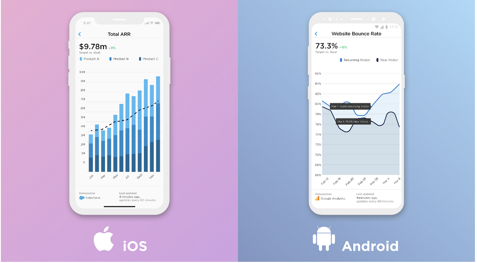
B. Adapting to Different Mobile Platforms: iOS vs. Android
Developing mobile-friendly data visualization software faces challenges in aligning with distinct iOS and Android design standards. Differences in navigation, controls, typography, and other platform standards impact data visualization and user experience. For instance, iOS and Android employ different navigation styles, affecting the layout and accessibility of visualization components. iOS's higher resolution demands sharper graphics, while Android's varied screen sizes require adaptable layouts.
However, Grow, a versatile Business Intelligence Data Visualization compatible with iOS and Android, stands out with unlimited user access, no per-seat charges, and robust integrations. Cross-platform compatibility and performance are addressed through responsive design and extensive testing. Therefore, overcoming these challenges empowers organizations to gain impactful insights
C . Real-time Data Updates
Real-time Data Updates in Mobile BI empower users with access to real-time insights and alerts on smartphones and tablets, facilitating swift decision-making. Challenges include data synchronization, visualization across devices. Data synchronization ensures consistency with factors like network connectivity and security, while effective visualization across devices faces challenges in limited screen space, varying orientations, and diverse user preferences on mobile devices.
Grow, a leading Business Intelligence Data Visualization software, excels in data integration, connecting information from diverse sources like Salesforce, Hubspot, and Google Analytics. However, the risk of information overload in mobile BI emphasizes the need for careful data filtering and quality assurance measures for accurate decision support.
D. Touch-Optimized Interactivity
Developing mobile-friendly data visualization software requires prioritizing intuitive touch gestures and adhering to platform guidelines. Features should be adapted for touch with larger buttons and menus, balancing optimization to avoid overwhelming users with limited screen space and attention spans. Achieve this balance through techniques like progressive disclosure and adaptive layouts based on user preferences.
E. Collaborative Features
Developing mobile-friendly data visualization software requires integrating collaborative features to meet the evolving needs of remote and hybrid work environments. Grow addresses these challenges by supporting collaborative features that facilitate teamwork on data analysis and visualization projects.
For example, Edit Suits Co. streamlined operations with Grow Business Data Visualization while expanding to London and Singapore. Facing data management challenges, Grow's single dashboard consolidated KPIs, providing real-time insights despite geographical distance. This facilitates team collaboration, allowing their team to work together on data analysis and visualization projects, enhancing productivity and decision-making.
F. Advanced Data Exploration Capabilities
To enhance mobile-friendly business data visualization, prioritize tailored insights with Grow's ad-hoc querying. Perform on-the-go queries on your mobile device, interact with data through drill-downs, filters, and hierarchies, uncovering hidden patterns.
Grow supports complex visualizations, like coordinated views and interactive charts, for comprehensive multidimensional analysis. Additionally, its data storytelling features enable effective communication of insights. Discover more on Grow Features & Capabilities on GetApp.
Challenges in Implementing Mobile Data Visualization
A. Security Concerns
Mobile Data Visualization Software demands robust security against threats like data breaches, theft, and unauthorized access. Diverse mobile platforms complicate security, with iOS offering stronger features but more restrictions than Android. For example, IOS devices offer robust encryption and biometric authentication, outperforming Android in security. However, iOS imposes more restrictions on data sharing and customization. Grow addresses these challenges with SSL encryption, two-factor authentication, and role-based access control, ensuring a secure mobile data environment.
B. Data Complexity
Mobile data visualization copes with the challenge of handling high-volume, varied, and rapidly changing data. It must efficiently process, aggregate, and filter data without compromising quality. Additionally, it adapts to limited mobile screen size, resolution, and bandwidth, impacting readability and interactivity.
Best Practices for Developing Mobile-Friendly Data Visualization Software
Design clear and intuitive interfaces for easy interaction.
Leverage mobile capabilities (touchscreens, sensors) for enhanced features.
Optimize performance to address limited screen space and varying resolutions.
Select appropriate visualization elements for effective messaging (charts, graphs, maps).
Ensure attractive, readable visualizations with suitable colors, fonts, labels, legends, and annotations.
Conclusion
Mobile-friendly Business Intelligence Data Visualization solutions empower users to analyze and make decisions on the go, fostering collaboration and sharing insights. However, implementing mobile data visualization software includes user training, adoption, and integration with existing business systems, which is crucial for the effective utilization of features.
Grow ensures quick user adoption with intuitive interfaces, tutorials, and support. Its excellence in data integration connects diverse sources like Salesforce, Hubspot, and Google Analytics, including custom data sources and APIs. With Adaptation Grow leading the way, users experience seamless data connectivity, unlocking the power of mobile data-driven decision-making. Backed by user-centered design, Grow offers a satisfying mobile-friendly experience. Trusted by over 20,000 customers, unlock seamless data connectivity with a 14-day free trial.


Comments
Post a Comment